
LEAGUE OF WOMEN VOTERSWE THE PEOPLE ARE FREE TO VOTE
A native app solution offering a voter haven for verified, fact-checked electoral information, events, and registration
⏳ FULL CASE STUDY - 10 MIN. READ | ⚡️FINAL DESIGNS - 4 MIN. READ


OVERVIEWThe League of Women Voters has been empowering and protecting voters through education and advocacy, for over 100 years. Through providing electoral voter guides, registering voters in person, and posting diligently on how and where to get involved; they fight to uphold democracy for all.

THE CHALLENGEDESIGN A PLATFORM TO ATTRACT NEW VOTERS
With the aftermath of COVID still heavy on their minds, the League of Women Voters needed to pivot before the upcoming 2024 elections. In the past, they relied heavily on handing out voter pamphlets, orchestrating rallies, and many other social gatherings to spread electoral information. COVID destroyed that model as the standard. With uncertainty and caution, they knew it was time to re-platform.
We were tasked to create a native app within 2 weeks that meaningfully engages users on current and evolving issues all while catalyzing specific calls to action that align with their organization.
TOOLSFigma
Illustrator
Photoshop
Google Forms
Mural
Lucid Chart
Google Suite
Zoom
RESPONSIBILITIESProduct Design
Lead UI
UX Research
Wireframing
Prototyping
Project Management
TEAMShelby Hamilton
Helen Yoo
Rebecca Simon
TIMELINE2 week sprint

THE PROBLEMNOT THE YEAR FOR THE POLLS TO BE DOWN
In response to the devastation of COVID, the chaos of suspected voter fraud in the the 2020 election, rising tension in the Middle East, economic instability, and recent mass layoffs; 2024 is proving how important it is, more so than ever, to educate and encourage a newer and younger demographic to take immediate action.
The League of Women Voters is navigating the challenge of an outdated website and traditional in-person voter guide distribution, which doesn't cut it in today's fast-paced, digital world—especially in light of COVID-19. To keep users engaged and attract a fresh wave of young voters, we needed to create a vibrant, user-friendly platform that delivers non-partisan, timely information right at their fingertips. It's time to innovate and make voting information as dynamic and accessible as the voters we aim to serve.
To accurately understand the task at hand, we had to research our incumbent, who their target demographic is, and how prospective new users consume political information.
By performing a general site usability test, we got a basic understanding of offerings, however here we found major hiccups that could cost them big with the ever-changing voter scape moving to digital platforms. From buried information to plenty of redirections, it was clear we had our work cut out for us in the primaries.
TOOLS: BUSINESS AUDIT, USABILITY TESTING, HEURISTIC EVALUATION, COMPETITOR ANALYSIS, STAKEHOLDER INTERVIEWS
DISCOVERWHO HAS THE POWER?

PRELIMINARY USABILITY TESTING
Navigation led to “why it matters” When attempting to find pertinent news, users found themselves confused and overwhelmed when redirected to pages that promoted the why but not the how to get involved.

users had to scroll to the bottom to find current newsUsers who want to stay engaged and informed found it frustrating that they could not quickly navigate to news or event information.

HOW TO TAKE ACTION WAS OBSCUREWhile there was plenty of information leading to other sites and how to take action through their causes, it felt as though LWV lacked the necessary Call to Actions with the appropriate follow-through.
REDIRECTED TO A DIFFERENT SITE TO REGISTER TO VOTEWith the League of Women Voters being a valuable community resource, users were left questioning why they could not register through the site directly.

LOCAL LEAGUES REDIRECTED OFF SITEWhen hoping to find out how to get involved locally, users were once again redirected off-site to their local chapter and forced to sort through more tedious information to find how and where to take action.
what users are saying…


heuristic evaluationEFFICIENCY AND SATISFACTION DOWN IN THE POLLS
To better understand how our client prioritized information for their audience and identify features we could later incorporate, we conducted a heuristic evaluation based on Nielsen Norman's 10 usability heuristics. Here we found that efficiency and satisfaction were the most prominent issues users faced.
The final read-out illuminated that searching and filtering current news and blog posts were non-existent, no FAQ was present, and current events were also nowhere to be found on the homepage. Taking this information we were able to then tailor our research activities to look at relatable organizations to see how they compared in layout with these heuristics in mind.

COMPETITOR ANALYSISDELIVERED FIRM CALLS TO ACTION
To get a framework as to how to proceed with our design, we reviewed three competitors of the League of Women Voters. We noted features that we thought worked well, along with features we thought hindered the user experience with pulses and deltas.
We furthered our analysis with a feature inventory list to see how they stacked up against one another. It was here rivals rose in votes with clearer accessibility, account login, calls to action, location services, and visuals. Once again we saw our campaign to the public was falling short of the competition.


ACCESSIBLE LATEST NEWSACLU offered Latest News just below the hero, which allowed users to quickly access trending articles and relevant topics.

CLEAR CALLS TO ACTIONYWCA wowed users with sharp contrast and color play in their calls to action.

STRONG VISUALSUnite America utilized strong imagery and graphics to convey their message loudly and proudly.
STAKEHOLDER INTERVIEWSMAILED IN THEIR BALLOT
Debbie Voss, a pundit of the League of Women Voters, gave us valuable insider information in regards to the rapid change in demographics, what they raise money for, how they allocate resources, what they are doing, and what they need to survive the times.
85%
BEFORE 2016 WERE OVER 55+
60%
IN 2016 WERE OVER 55+
50%
IN 2020 WERE AGES 35-45
80%
OF THE TIME PASS OUT PAMPHLETS WITH VOTER INFORMATION
20%
OF THE TIME TAKE PHONE CALLS TO RELAY VOTER INFORMATION
$60K
NEEDS TO BE RAISED PER YEAR

DONATIONS ARE IMPERATIVE TO MAINTAINING THE ORGANIZATION
MONEY NEEDED TO TRANSLATE VOTER GUIDE INTO FOUR LANGUAGES

NEEDS A NEW WAY TO CONTACTLESSLY SHARE INFORMATION

The League of Women Voters is looking for new ways to engage new and timely users. What better way than to utilize the growing number of younger generations to inspire a future that they can share in? With the rise of personal advocacy and social equality, we see our youth is deeply committed to creating a positive impact on the future of humanity.
After our in-depth conversation with our local chapter representative, where we confirmed the demographic was rapidly changing with hard facts, we knew it was time to swing with the times.
By introducing a new persona we could begin to develop a platform that would appeal to our new demographics’ needs so that we could engage, excite, and delight them all to be more proactive in the current political landscape.
TOOLS: USER PERSONAS, PROBLEM STATEMENT, HYPOTHESIS
DEFINEWHO HAS THE SWING VOTE?
USER PERSONA
PROBLEM STATEMENTThe Empowered Youth needs a way to engage with unbiased, relevant political content because they are unsure how to navigate their current perception of the biased, opinion-heavy political climate without experiencing doom scrolling.
HYPOTHESISWe believe that by designing a mobile app where the empowered youth are presented with verified political content personalized to their topical interests and geographic location, they will feel more:

Engaged with politics
Empowered to take action with informed decision-making
Connected to their individual role & significance within larger political systems
Based on how people already engage with politics through their phones and social media, a LWV mobile app was a golden opportunity to rally meaningful political engagement with a diverse crowd, all without in-person interactions, expediting the growing need for rapid information exchange. By blending LWV’s non-partisan stance with content users find interesting, we saw the potential for LWV to become the go-to source for verified, trustworthy political content that people crave.
TOOLS: USER SURVEYS, COMPARATIVE & COMPETITIVE ANALYSIS, USER FLOWS, DESIGN STUDIO, AFFINITY MAPPING, SKETCHING, WIREFRAMING, PROTOTYPING, USABILITY TESTING
DEVELOPOPEN THE POLLS
USER SURVEYS“SCROLLING” WITH THE HOMIES
Through the use of Google Forms, we were able to get turnkey feedback from 82 respondents. This straw poll, an ad hoc or unofficial vote to show the popular opinion on a certain matter, allowed us to more clearly understand how 20-30-year-olds digest, engage, share, and scroll.
Understanding our users’ pain points when it comes to having faith their news is coming from reliable sources was pivotal. This information helped us know the majority opinion and gain votes toward our final design choices.

84.6%
USE SOCIAL MEDIA FOR POLITICAL ENGAGEMENT
76.9%
FELT ELECTION WAS KEY INTEREST
82.3%
WANTED CURRENT EVENTS
69.2%
STRUGGLED TO FIND UNBIASED POLITICAL CONTENT
61.5%
PREFERRED FACTUAL CONTENT OVER OPINION BASED
46.2%
WANTED ADDITIONAL RESOURCES
There was no reason to reinvent the wheel here, as many available platforms have tried and true market research on how people enjoy receiving information. These bigger brands offered insight into how we might organize our information architecture to create a dynamic and trusted year-round information hub and resource.
THE OPPONENTS
COMPARATOR ANALYSISTHIS YEAR’S NEWSWORTHY CANDIDATES TAKE THE MAP

NEWS FEEDSBy way of comparative analysis, we gathered that Apple News & NBC News offered immense insight in regards to how to sort and categorize news feeds, offer users select topics of interest, relay trending stories, be inclusive to all news sources, and finally have industry standard iOS share features.

GEOLOCATIONLater we looked at the geolocation offerings of two independent platforms. By utilizing geolocation mapping to populate relevant events, polls, rallies, and places to register in proximity to our users we recognized we could alleviate user stress when finding how and where to get involved.
COMPetitive ANALYSISSTARTED WITH LOCAL REPS

INTERESTS & GAMIFICATIONWe naturally looked at platforms already working within the political engagement realm. We needed to see how our competitors were sourcing their information to populate relevant news specific to our users’ local and state news.
Here we found that Impactive, a native app that used gamification to promote activism, utilized zip codes at the time of onboarding, along with a brief survey to understand users’ political leanings to get them involved in teams.
DESIGN STUDIOHOW MIGHT WE BUILD A STRONG CAMPAIGN
With our background business context and initial research completed, we moved into a design studio activity with a few close design friends to gain an outside perspective. Here we churned up a variety of How Might We’s within Mural to help us brainstorm, identify themes, and ideate different design modalities that aligned with our client's needs.
From this activity, we were able to see the emphasis on trust, the need for unbiased information, and unique opportunities to engage them through this foundation.

SKETCHINGVISUALIZING A WIN
Sketching individually, we loosely mapped our main screens to get a better sense of layout, content, and navigation after our preliminary round with the design studio. We regrouped to identify commonalities and differences between each to move forward with our user flows, low/mid-fidelity MVP wireframes, and design iterations.

USER FLOWSFINDING THE ROAD TO VICTORY
Once we established our baseline features, it was essential to map our user flows. Through Lucid Chart we were able to digitally collaborate how users navigated these elected features. This served as a guide throughout the remainder of our sprint, to ensure we stayed on track with what we were promising the people.

DESIGNA CLEAR CANDIDATE WAS ELECTED
With no time to lose, our methodology served as a winning tactical maneuver and cost-saving measure to analyze and predict critical issues that affected our users’ desire to get involved. Here we found where and when our opponents were raising the appropriate public awareness while gleening how to one-up them to ensure an election-changing mobile app that would rally the masses to action.

PROPOSED FEATURES:
🇺🇸 User Personalization
Onboarding with geolocation and topical interest selection
🛰 News Feeds
Trending articles with regional filtering of national, state, or local news
🎖 Verified Content
Building trust with factually checked articles
🎇 Engagement Options
Like, comment, share, or save content to help personalize user experience and share information easily
🌭 Events
Access to local, state, and national events, voter polls, registration offices, rallies, and more!
🦅 Information & Resources
Register to vote, find a chapter, and representatives, invite friends, and give donations
The design phase involved creating a user-friendly app that catered to the League's objectives of delivering verified, fact-based content while ensuring contact-free distribution of electoral information.
1. User-Centric Information Architecture: To address the problem, I started with a well-structured information architecture. I created a navigation system that featured news, resources and events while filtering into locational categories of national politics, state, and local. This made it easy for users to find information pertinent to their political scale, including their state and county as a political unit.
MID-FI WIREFRAMES & USER TESTINGDELIVERING ON OUR PROMISE
2. Intuitive User Interface: The design approach was chosen to create a non-partisan, neutral, and trustworthy atmosphere while maintaining an air of fun and youth. The app design prioritized a clean and intuitive user interface to minimize cognitive overload.
3. Interactive Features: To enhance user engagement, I integrated interactive features such as likes, comments, save, share options, and an events map. Users could interact with news articles, send information quickly, and find the closest rally or voter poll to get involved directly.
Once mid-fidelity wireframes were staged, I conducted several rounds of usability testing. By testing users, I gathered what was working and where I was falling short, this allowed me to see how to raise the bar.

USABILITY TESTING AFFINITY MAPPING & DESIGN STUDIOHEARING WHAT NEEDS TO CHANGE FROM THE PEOPLE
Part of being a person for the people is hearing and reacting to sensitive feedback, utilizing both a politician’s and UX designer’s greatest asset, empathy! We understood from a political sense that a candidate represents the whole, and our app is needed to translate to the masses with no error. Through a round of usability testing, we were able to pinpoint areas of friction, misunderstanding, and opportunity.
From affinity mapping, we identified that users enjoyed the engagement upon entering the app and that the login/sign-up process was intuitive for them. However, they struggled with associating certain icons to the task, understanding what verification meant, and additional areas where layout spacing could be improved.
Once we completed our usability testing affinity map, we moved into a design studio session to iterate and fine-tune our platform.

WINS:✅ Users felt comfortable with the layout and understood the local navigation between national, state, and local filtering.
✅ Users liked being prompted for their zip code to locate news and events close to them.
✅ Users liked the countdown to the election day banner.

OPPORTUNITIES:⛔️ Users needed prior knowledge to understand our verification badge and what it meant.
⛔️ Users needed larger and more recognizable social share buttons. Introducing Mac iOS standard share icons would suffice.
⛔️ Users needed clarification with icons. They felt unsure of how to navigate our bottom toolbar.
ITERATIONSPIVOT. PIVOT. PIVAT!
(Five bonus points if you know this iconic Friends reference)
Iterating on our initial designs I made a few improvements. Once completed users had a much easier time understanding the intention of the verified badge and how to properly identify our navigation icons. We were steadily on our way to Election Day with preliminaries showing we had the majority vote.

VERIFICATION BADGE
Users felt unsure of what the shield with checkmark represented. One even commented that they felt it had to do with malware.

VERIFICATION BADGE 2.0
I replaced the icon with a much more recognizable “verified badge” that users would discern more quickly due to its use on Instagram.
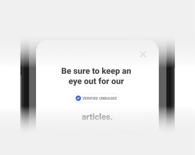
VERIFICATION BADGE POP-UP
To ensure users understood the badge, I added a simple pop-up on entry to the news feed to educate users about its meaning.

VERIFIED UNBIASED ON ARTICLES
To triple down and give our users an extra vote of confidence and trust in their reputable news sources, I added the “Verified Unbiased” tag on verified articles.


NAVIGATION ICON TITLES & NEW ICONS
Cleaning up our speech was an easy fix. By adding simple titles under our icons I clarified to users what our three navigation items were to help them take control of their experience. By replacing the icons, I also gained a greater vote of confidence with users retesting.
UPDATING LWV’S BRAND FOR A BOLD, YOUTHFUL POP
While the League of Women Voters has undergone some updated branding, taking the brand from a traditional red and blue to a more non-biased palette of purples and yellow to demonstrate their commitment to upholding equality for all regardless of party affiliation, they lacked an effervescent punch that would resonant with a younger demographic. Here I decided to interject brighter color values and gradients to appeal to the new target demographic who would be largely engaging with our platform.


YES, WE CAN
We heard what the Empowered Youth wanted and needed by hitting the web to let them voice their concerns. I took their voice seriously and created a native app that offers user-generated news feeds with verified unbiased news, quick social share options for them to spread the word to their network, and gave them an interactive events map that geolocates so they can know where and how to get involved.
TOOLS: HI-FI WIREFRAMES, PROTOTYPING
DELIVERTHE ELECTED OFFICIAL
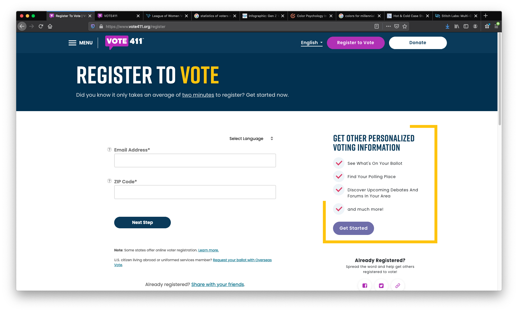
ONBOARDING
Users are welcomed to the League of Women Voters’ new native app with a brief introduction and the features they can look forward to enjoying.
Here they could easily “Skip” if they were uninterested, they can “Next” through the screens if desired, all while they can see how far along they are with the progress bar.
A key feature we found useful was the translate to Spanish option. While we have language options within the app for more obscure language choices, Spanish-speaking natives have grown to account for 15% of the population.

WELCOME SCREENS
NEW USERSUsers are ushered to our welcome screens. Here they can Sign In or Create an Account. Here, we found users loved the idea of “noiseless news” as 4/5 users called out this specific UX Writing copy.
RETURNING USERSReturning users are welcomed personally by name with a home screen that displays a call out for topics that are of greatest interest to them. Here Dana is alerted that there are 2 rallies this week for Voter Rights, this will encourage her to navigate to our Events page, find information and potentially share with friends.

NEW ACCOUNT SIGNUP & INTERESTS SELECTION
New users get happily ushered in with a quick three-page onboarding. Here they have the option to enter their zip or skip, select a user name or remain anon and sign in as a guest, and finally hand-pick topics they would like displayed on their news feeds.


PERSONALIZING THE EXPERIENCE
GEOLOCATIONBy allowing new users to log in with their zip code, we are able to generate feeds that are relevant to their area, populate the correct voter guide ballot and auto-select a local chapter to make it easy for them to get involved.
TOPICAL INTERESTSPersonalization is one of the most sought-after experiences in 2024. 71% of users expect a personalized experience, while 76% are frustrated if they don’t receive them and 84% of users said that being treated as an individual with unique interests is important to winning their business.*
BREAKING THE NEWS GENTLY
Incorporating unbiased news from outside sources was a must-have for users. The League needed to provide more content to engage users daily to ensure their Calls to Action were not falling on deaf ears. We chose to break down our news by the following:
BREAKING NEWS: Urgent topical information
TRENDING NEWS: Highest engaged content
GOOD NEWS: Feel good because we could use a pick-me-up
LATEST FROM THE LEAGUE: League-related news
TAKE ACTION: Calls to action to get users involved
THE LEAGUE FEED: The League’s Instagram Feed to cross-promote. Something we do not see on the current site.

ANATOMY OF THE MAIN APP SCREEN

ARTICLES, VERIFICATION BADGES & SHARE OPTIONS
VERIFICATION BADGE
A main concern for users was deciphering if their news was unbiased and fact-checked. I added a blue badge to distinguish unbiased articles from non-fact-checked articles. The objective was to help users feel a sense of trust when scrolling through the never-ending onslaught of opinion pieces that circulate during elections.


SOCIAL SHARE OPTIONS
The greatest asset the World Wide Web ever gifted us was the ability to share news amongst one another without the need to assemble. Millennials and younger generations know the power of a simple share. Incorporating iOS standard social share options gives our users the advantage of getting information out quickly. Showing how many likes and shares motivates users to get involved when they see others actively engaging with a topic.

EVENTS
COVID destroyed the stability of the League’s annual events, voter guide distribution, and rallies. It also shifted the entire population to more digital solutions.
With my Events page, I alleviated user stress, by showing the following:
What’s happening on a local, state, or national level
Where users can register as voters
(if they didn’t simply register on our platform)
Where voter polls are located
Rally locations and safety precautions
Share resources with friends to meet up

ACCOUNT PAGE
Politics can be confusing enough with plenty of false hopes and empty promises. I wanted full transparency in our platform with no hidden agenda or difficult-to-find pasts. On our Accounts Page, I made the bill easy to digest and accessibility friendly with:
Quick Account Information
Access to Saved Information
Easy Test Size Change
Interactive Help Center
KEY FEATURE:
Users can easily change their language settings to translate the voter guide information into their native tongue.
DISCOVER RESOURCES
The League’s main agenda is to distribute Voter Guides to keep voters informed and voting. In a Post-COVD world, voters are moving to digital platforms preferring contactless access to information. Users here can discover their nation, state and local representatives, find registration times and locations, they can register to vote, find local chapters, invite friends, and access infographics, and guides on how they can take action.

NEXT STEPSELECTION DAY AND BEYOND
League of Women Voters with their vast knowledge and years of experience have greatly impacted the direction of voter rights for over 100 years. I hope with this app, we can take them into the 21st century with relevant tools to conquer their dreams of truly empowering voters and defending democracy.
To further improve the app, I recommend ongoing user research to keep pace with evolving user needs. Additionally, the League can explore partnerships with educational institutions and other civic organizations to expand its user base. Regular updates to content and technology will be essential to maintain the app's relevance and effectiveness.

WHAT I LEARNEDDESIGNING FOR THE NEXT GENERATION
01 - User-Centricity PrevailsPrioritizing user needs and preferences, especially in a tech-savvy demographic is paramount as we continue to evolve exponentially. Understanding consumption habits, preferred content formats, and engagement triggers is essential for dynamic product development.
02 - Navigating Information OverloadThe World Wide Web opened up a new Pandora’s Box inundating users with copious information from thousands of sources, making it crucial to streamline content delivery. Implementing intuitive navigation and personalized content recommendations can help future users efficiently access relevant news while mitigating information overload.
03 - Fostering Civic EngagementBeyond news consumption, civic engagement among younger generations is a must as they reach to combat antiquated systems. Integrating features such as interactive polls, discussion forums, and calls-to-action empowers users to stay informed and actively participate in democratic processes.
04 - Continuous Feedback LoopEstablishing feedback mechanisms fosters a culture of constant improvement. By soliciting and incorporating user feedback, we ensure technological evolution in alignment with the ever-changing needs and preferences of the people, keeping the power out of the grip of large corporations seeking to beguile users with various tactics similar to greenwashing.


